どうも、プロンプト画伯です。
今日はね、ブロガーなら誰もが経験するあの地獄について話そうと思う。
「記事は書けた。でもアイキャッチ画像が決まらない」問題。
わかるよ、めっちゃわかる。Unsplashで「business」って検索して、3ページ目くらいで「なんか違うんだよな...」ってなるやつでしょ。気づいたら30分経ってて、もはや記事書いてた時間より長いっていう。
俺も昔はそうだった。でもね、AI画像生成を使い始めてから、この問題が完全に消えたんだよね。
センスじゃない、言語化だ。
今日は、統一感のあるアイキャッチ画像を「量産」するためのテンプレートプロンプトを惜しみなく公開していくよ。
なぜフリー素材じゃダメなのか
いや、ダメじゃないんだけどさ。フリー素材には3つの限界があるんだよね。
1. みんな同じ画像を使ってる
「握手してるビジネスマン」の画像、何回見た?ってレベルで被る。読者も「あ、またこれか」ってなる。
2. 記事の内容にピッタリの画像がない
「ChatGPTでブログを効率化」みたいな記事に合う画像、フリー素材で探すの結構キツくない?抽象的すぎるか、古臭いかの二択になりがち。
3. 統一感を出しにくい
サイト全体のトーンを揃えたいのに、素材サイトの画像ってバラバラじゃん。色味も、雰囲気も、構図も全部違う。
AI画像生成なら、これ全部解決できるんだよね。
アイキャッチ画像の基本サイズ
プロンプトの話の前に、サイズの話をしておくね。これ意外と大事。
推奨サイズ
ブログのアイキャッチなら、基本的に 1.91:1(横長) で作っておけばOK。OGPにもそのまま使えるしね。
AI画像生成ツールでの指定方法:
- Midjourney:
--ar 191:100または--ar 16:9 - DALL-E 3: 「1792×1024」を選択
- Stable Diffusion: 1216×640 や 1344×768 あたり
量産のカギは「テンプレートプロンプト」
ここからが本題。
毎回ゼロからプロンプトを考えてたら、結局時間かかるじゃん。だから、カテゴリ別のテンプレートを用意しておくのがコツ。
俺が実際に使ってるテンプレートを紹介していくね。
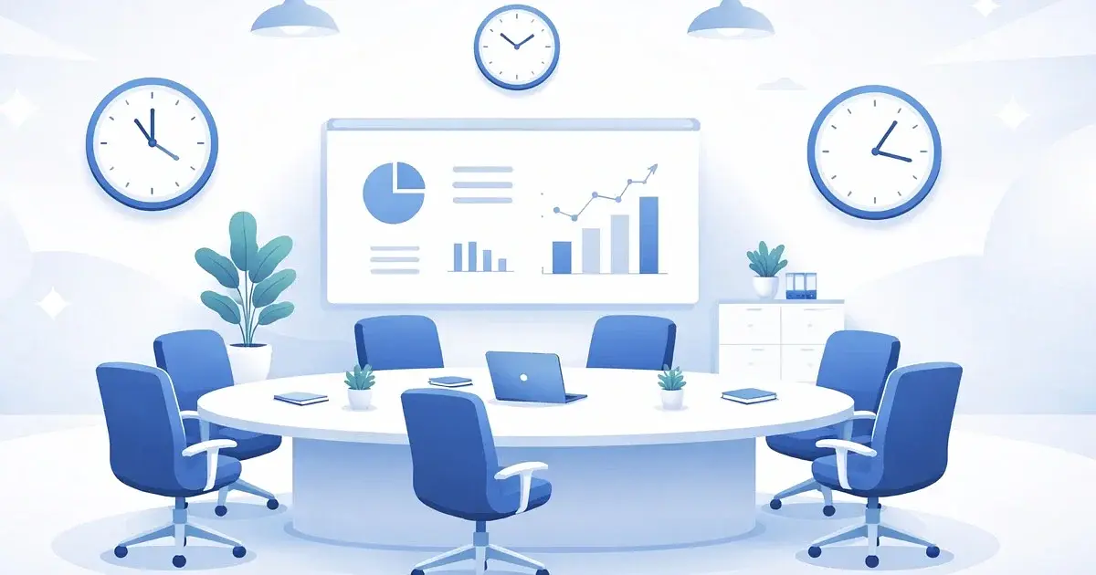
テンプレート① ビジネス・仕事術系
ビジネス系の記事って多いよね。「時短術」「生産性」「会議」みたいなテーマ。
基本テンプレート
Clean minimalist illustration of [テーマのモチーフ],
corporate blue and white color palette,
simple geometric shapes,
professional business style,
soft gradient background,
modern flat design,
no text
具体例:「会議を効率化する方法」の記事
Clean minimalist illustration of a streamlined meeting room with floating clock icons,
corporate blue and white color palette,
simple geometric shapes,
professional business style,
soft gradient background,
modern flat design,
no text
具体例:「タスク管理術」の記事
Clean minimalist illustration of organized checklist with completed tasks floating in space,
corporate blue and white color palette,
simple geometric shapes,
professional business style,
soft gradient background,
modern flat design,
no textポイント: corporate blue and white で色味を固定してるから、何枚作っても統一感が出る。これ超大事。
テンプレート② テック・AI系
俺がよく書くジャンル。ChatGPTとか、プログラミングとか。
基本テンプレート
Futuristic digital illustration of [テーマのモチーフ],
dark purple and cyan neon color scheme,
glowing circuits and data streams,
tech aesthetic,
abstract geometric elements,
cyberpunk inspired but clean,
no text
具体例:「ChatGPTの使い方」の記事
Futuristic digital illustration of an AI chat interface with floating speech bubbles,
dark purple and cyan neon color scheme,
glowing circuits and data streams,
tech aesthetic,
abstract geometric elements,
cyberpunk inspired but clean,
no text
具体例:「Pythonで自動化」の記事
Futuristic digital illustration of a snake made of code and data flowing through circuits,
dark purple and cyan neon color scheme,
glowing elements,
tech aesthetic,
abstract geometric background,
cyberpunk inspired but clean,
no textポイント: dark purple and cyan neon がテック系の鉄板カラー。映える。
テンプレート③ ライフスタイル・暮らし系
生活の知恵とか、日常のTips系の記事向け。
基本テンプレート
Warm cozy illustration of [テーマのモチーフ],
soft pastel colors with warm orange and cream tones,
gentle lighting,
lifestyle magazine aesthetic,
comfortable and inviting atmosphere,
simple clean composition,
no text
具体例:「朝活のすすめ」の記事
Warm cozy illustration of a peaceful morning scene with coffee cup and sunrise through window,
soft pastel colors with warm orange and cream tones,
gentle lighting,
lifestyle magazine aesthetic,
comfortable and inviting atmosphere,
simple clean composition,
no text
具体例:「部屋の片付け術」の記事
Warm cozy illustration of a minimalist organized room with plants and natural light,
soft pastel colors with warm orange and cream tones,
gentle lighting,
lifestyle magazine aesthetic,
comfortable and inviting atmosphere,
simple clean composition,
no textポイント: warm orange and cream tones で優しい雰囲気に統一。読者にリラックス感を与える。
テンプレート④ お金・投資系
マネー系の記事。信頼感が大事なジャンル。
基本テンプレート
Professional illustration of [テーマのモチーフ],
deep green and gold color scheme,
clean modern design,
financial trustworthy aesthetic,
subtle upward trending elements,
minimalist style,
no text
具体例:「初心者向け投資入門」の記事
Professional illustration of growing plants with coins as leaves representing investment growth,
deep green and gold color scheme,
clean modern design,
financial trustworthy aesthetic,
subtle upward trending elements,
minimalist style,
no textポイント: 緑と金は「お金」「成長」「信頼」を連想させる色。意図的に使ってる。
テンプレート⑤ 学習・スキルアップ系
勉強法とか、スキル習得系の記事。
基本テンプレート
Inspiring illustration of [テーマのモチーフ],
bright yellow and light blue energetic colors,
dynamic composition with upward movement,
educational and motivating mood,
modern graphic style,
clean background,
no text
具体例:「英語学習を続けるコツ」の記事
Inspiring illustration of books transforming into flying birds with speech bubbles,
bright yellow and light blue energetic colors,
dynamic composition with upward movement,
educational and motivating mood,
modern graphic style,
clean background,
no textポイント: 黄色と青は「活力」「前向き」な印象。学習系にぴったり。
統一感を出す3つのルール
テンプレートを使うだけじゃなくて、この3つを意識すると、さらに統一感が出るよ。
ルール1: カラーパレットを固定する
サイト全体で使う色を2〜3色に絞る。俺の場合は:
- メインカラー: ブルー系
- サブカラー: 白/グレー
- アクセント: オレンジ
これをプロンプトに毎回入れる。
ルール2: スタイルを固定する
「イラスト調」「写真風」「3D」とか、スタイルを1つに決める。
俺のおすすめは flat illustration(フラットイラスト) か minimalist illustration。シンプルで、どんなテーマにも合わせやすい。
ルール3: 「no text」を必ず入れる
AI画像生成って、勝手に文字入れてくることあるじゃん。しかも読めない謎の文字を。
no text を入れておくと、これをかなり防げる。完璧じゃないけど、入れないよりマシ。
実際の作業フローを公開
俺が記事を書くときの流れを公開するね。
- 記事を書き終える
- 記事のテーマを一言で言語化する(例:「ChatGPTで記事作成」)
- カテゴリに合ったテンプレートを選ぶ(例:テック系)
- [テーマのモチーフ] 部分を埋める
- 画像生成(2〜3パターン出す)
- 一番いいやつを選んでリサイズ
- 完了!
これ、慣れると5分で終わる。30分素材探してた頃が嘘みたい。
よくある失敗と対処法
俺も最初は失敗しまくったから、そのへんも共有しておくね。
失敗①: プロンプトが具体的すぎる
「青いシャツを着た30代の男性がMacBookの前で笑顔で作業している」
みたいに書くと、AIが困る。要素が多すぎて破綻しやすい。
対処法: 抽象的なモチーフ + スタイル指定 にする。人物は入れないほうが安定する。
失敗②: 毎回色味が変わる
カラー指定を忘れると、青だったり赤だったりバラバラになる。
対処法: テンプレートにカラー指定を必ず含める。
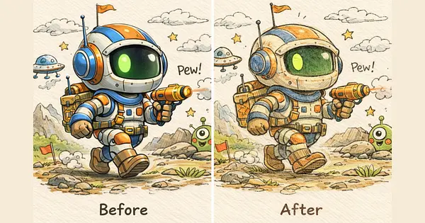
失敗③: 文字が入っちゃう
「BUSINESS」とか「SUCCESS」とか、読めるような読めないような文字が入る。
対処法: no text, no letters, no words を全部入れる。それでも入ることあるけど、確率は下がる。
まとめ: 量産こそ正義
アイキャッチ画像って、1枚にこだわりすぎても正直コスパ悪いんだよね。
ブログで大事なのは、一定のクオリティを保ちながら、継続して記事を出し続けること。画像探しで消耗してる場合じゃない。
テンプレートプロンプトを用意しておけば、
- 5分で画像が作れる
- 統一感のあるサイトになる
- 他のブログと被らない
- 素材の著作権を気にしなくていい
いいことしかない。
まずは今日紹介したテンプレートをそのままコピペして、1枚作ってみて。思ったより簡単だから。
センスじゃない、言語化だ。
言語化さえできれば、絵心ゼロでもアイキャッチは量産できる。
それじゃ、また次回。
- 4
- 1

元デザイナー → AI画像職人。絵心ゼロだったけどプロンプト極めたらなんとかなった。「センスじゃない、言語化だ」 使えるプロンプト&失敗例を晒していく
こちらもおすすめ
-
AI脱社畜
- 1
- 0
-
プロンプト画伯
- 2
- 0
-
 AI集客@ルイ
- 3
- 0
-
- 4
- 0
-
- 3
- 0
-
 AI経営者の参謀@ひで
- 29
- 1
-
- 4
- 0
-
コードを読まないAIエンジニア
- 1
- 0
-
- 5
- 0
-
- 2
- 0
-
- 2
- 0
-
- 3
- 0
-
 ゆい@海外AI副業ラボ
- 4
- 0
-
- 1
- 0
-
- 2
- 0
-
- 2
- 0
-
- 2
- 0
-
- 2
- 0
-
- 3
- 1
-
- 5
- 0
AimanaVo
あなたのAI知見も、資産にしませんか?
読んだ・試した・気づいた — そんな体験が誰かの力になる。 有料記事で収益化も、アフィリエイトも。
💬 コメント
ログイン か 会員登録 するとコメントできます